-
Introduction to the Launch Formula
Welcome2 Topics -
Your Guides
-
Why are you here?
-
Mindset: The Comfort Zone
-
Module 1: The MSP Business Model (from break-fix to MSP)The Business Model
-
Differentiation - Competitive Advantage
-
The Price and Cost Advantage
-
Introduction to ICP Avatar
-
Define Your Ideal Client Profile / Avatar (LF)3 Topics
-
Module 2 the problem you solveIntroduction to the Defining the Problem
-
The Problem You Solve4 Topics
-
MODULE 3: Define your Product and PriceIntroduction to Price and Product
-
Understand the elements of price (LF)
-
Design Your Product3 Topics
-
Module 4: Make The Whole Thing EfficientIntroduction to scalability
-
Manage Operations by Defining SOPs4 Topics
-
Module 5: Accelerate your ideal client salesIntroduction to Sales & Marketing
-
The Sales Process4 Topics
-
Dream 100
-
250 x 250 Strategy
-
Module 6: Create The Foundation for a Thriving TeamIntroduction to Values, Vision, and Mission
-
Core Values
-
Mission
-
Vision
-
Bonus: Clarify and Manage Expectations (legal documents)Why we do this
-
The Key Documents
-
Bonus: Simple finance for MSPs (AKA How to know whether you're making money)FInances for MSP3 Topics
-
Understand Management Financials (not accounting)3 Topics
-
Bonus: Tools to Create Your Brand IdentityBonus: Tools to Create Your Brand Identity3 Topics
-
Bonus:Find Additional MRR OpportunitiesBonus Finding Additional MRR Opportunities
-
Bonus: The Tools MSPs NeedThe MSP tools you will need to deliver product
Participants 605
Name, logo, colors and fonts: keep it simple
Jeff October 15, 2024
One of two things happens with names, logos, colors, and fonts: either people ignore them completely or get so wrapped up in them that they delay their start date by months.
Neither approach works.
First you must define these things to have consistency throughout your communications and materials. This helps people know they are working with one company and avoids a lot of format confusion that adds annoyance without any benefit whatsoever. Consistency in your materials communicates professionalism.
However, they don’t matter.
Nobody actually cares about your name or your logo. PRPS (pronounced purpose) Jeans have a stupid name and the world’s worst logo:
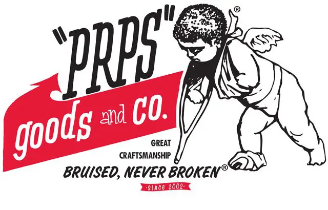
Well, I should say had because they recently rebranded and got rid of this atrocious mess. But they still sold ripped up jeans for hundreds of dollars and made it to many fashion runways. They built a very successful company, realized that their logo was awful, and changed it. That’s the right order and process.
So you will need a name, logo, defined colors, and fonts, you should keep these in a file (called a brand book or guide by those “in the know”) and refer to that file when you create anything.
Here’s how to to that.
Step 1: Pick a name
If you have a name, move on to step 2.
If you don’t have a name, go to ChatGPT and use this prompt:
I’m starting an IT company, a managed service provider, that supports [Your target market] with all of their IT needs. Give me five name ideas according to each of the three following experts: Alexandra Watkins, Brad Flowers, and Jeremy Millers. Present in the form of a table.
The three individuals are professional namers. You will get a table of names that looks like this:
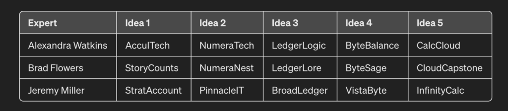
(I told chat GPT that I served accountants.)
Now, pick your favorite.
Done.
Step 2: Define Colors
In addition to black and white, you will want 4-5 colors. Chat GPT can find these for you as well.
Here is the prompt
Define three color schemes with 5 colors each that I can use for my brand. I want some contrast in the colors. I’d like them to convey strength be relatable to accountants but have something unexpected.
(Add in your preferences and your target market.
Usually ChatGPT can visualize the colors and spits out something like this:

The day I wrote this, the visualization engine wasn’t working, so it gave me this:
Scheme 1: Professional Elegance
- Deep Navy (#023047): A deep, trustworthy color that conveys professionalism and reliability.
- Soft Sky Blue (#A8DADC): Offers a refreshing contrast to the navy, suggesting clarity and approachability.
- Vibrant Coral (#FB8500): This unexpected, energetic color adds a dynamic element to the palette, perfect for calls to action.
- Pure White (#FFFFFF): Ensures clean design and offers a neutral background that enhances readability.
- Slate Gray (#8C8C8C): Provides a solid, understated foundation for the other colors, adding to the scheme’s sophistication.
Scheme 2: Bold & Trustworthy
- Rich Maroon (#6D2E46): A bold, deep color that evokes strength and passion.
- Muted Gold (#B4A582): Adds an element of luxury and stability, appealing to the professional aspect of accounting.
- Ivory Cream (#FFF1E1): Softens the overall look and offers a light, neutral canvas for branding materials.
- Forest Green (#264653): Represents growth and financial prosperity, making it relatable for accountants.
- Dusty Pink (#E9C8C8): Provides a gentle contrast, introducing a modern, unexpected twist to the palette.
Scheme 3: Dynamic & Innovative
- Electric Blue (#0077B6): A vibrant, energetic blue that stands for innovation and forward-thinking.
- Lemon Yellow (#FFD60A): Bright and eye-catching, this color adds a playful, creative spark to the brand.
- Midnight Black (#000000): Offers ultimate contrast, providing a powerful and sophisticated base.
- Platinum Silver (#E5E5E5): Modern and sleek, this color adds a futuristic touch to the brand’s visual identity.
- Fiery Red (#D00000): An aggressive, attention-grabbing color that signifies action and determination.
Either way, find a way to visualize these colors and choose the scheme you like best.
This is your color scheme.
Define your fonts
Finally, we go through the same process for the fonts. You always need two; one is the heading font, and the other is the body text. Mostly, you will use these fonts. (Sometimes, like this website, the default font is best for speed or performance reasons).
ChatGPT will happily help you with this task as well:
Here is the Prompt:
Please recommend three sets of two fonts that work together. I want them to work well on a website as well as print.
And what ChatGPT gave me:
Set 1: Professional and Modern
- Primary Font (Headings): Montserrat
- A geometric sans-serif typeface with a modern touch. Its clean, sharp lines make it perfect for headings and bring a contemporary feel to any design.
- Secondary Font (Body): Lato
- A humanist sans-serif typeface designed to complement Montserrat’s modernity with its warm, inviting forms. It’s highly readable in body text, making it an excellent choice for longer texts like articles or reports.
Set 2: Elegant and Timeless
- Primary Font (Headings): Playfair Display
- An elegant serif font with high contrast and distinctive curves. Ideal for titles and headings, it adds a touch of sophistication and tradition.
- Secondary Font (Body): Roboto
- A neo-grotesque sans-serif, Roboto is designed for readability and versatility. Its geometric forms pair well with the elegance of Playfair Display, ensuring clarity and a smooth reading experience in body text.
Set 3: Clean and Approachable
- Primary Font (Headings): Raleway
- A sans-serif typeface with a clean, yet slightly whimsical character. Its unique letterforms are ideal for headings, capturing attention while maintaining an approachable tone.
- Secondary Font (Body): Merriweather
- A serif typeface designed for high readability on screens. Its sturdy, traditional appearance complements Raleway’s lighter feel, making for comfortable reading in print and digital formats.
These all work fine; check the fonts in Google Docs or Word and pick the two you like the best.
Create your logo
The logo can be a pain. Again, keep it simple. You can ask ChatGPT; sometimes, it gives you great results, often, the logo is atrocious. A couple of online logo generators work just fine, so try one of those as well. Fiverr is an excellent option if you don’t mind spending a few dollars.
- Use a free logo creation service like Designmatic.
- Ask ChatGPT (though it doesn’t do a great job with this).
- Use Fiverr; it’ll cost you a few hundred dollars, but you may like the results better.
Remember that simpler is better.
Also, remember that when you are a successful company, you can pay someone an outrageous amount of money for a rebrand.
You will be fine if your name and logo aren’t offensive.
Once you have the logo, you can customize it with your colors; you also need a white version and a black version. If your logo is long or tall, make sure you have a small part of it as a mark that you can use for a favicon, buttons, and that sort of thing.
Put all of this in one document so that you always have easy access and can share it with others.
Here is a link to ours. It doesn’t need to be this creative, it does need to be a document.